Corporate Communication
The Otto Group has a vision:
Responsible Commerce that inspires.
With innovative strength and a clear stance on values, the Group is committed to its ecological and social responsibility. At the same time, the Otto Group is a group of companies that is digital through and through and stands for transformational power and agility. Time to firmly anchor this attitude and the sustainable self-image in the brand image and to carry it outwards with pride and in a contemporary way.
The result is a modern branding at the height of modern media: simple and easy to grasp, optimised for all devices - without getting lost in digital gimmicks that quickly become outdated. It conveys the company's values, gets to the heart of the matter and, thanks to simple rules, ensures maximum flexibility with a high level of recognition at the same time.
Two equally important trademarks form a flexible logo system. In addition to the revised word mark, there is now a so-called super mark: The two letters of the Otto Group, "O" and "G", were merged into a striking icon for this purpose. The catchy signet is simple, clear and appealing. In combination with the word mark, this creates a flexible system that meets all media requirements while always remaining recognisable.
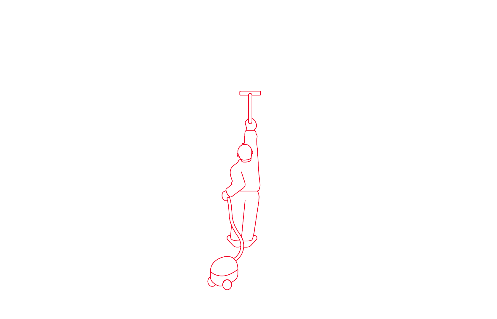
The clear, almost minimalist design is counterbalanced by the visual language. The photography is deliberately lively and creates substance - authentic people in natural situations as well as light, humorous illustrations.
The brand colour red remains the core of the corporate design in a slightly lighter, more lively tone. The Otto Group's new "Optimist" typeface was specially adapted. It appears open and dynamic, can be varied and is particularly easy to read on all devices and in all media.
Today, a digital brand convinces above all in the ease and clarity of digital touchpoints. In concrete terms, this means that the fundamentally redesigned website ottogroup.com intentionally appears very accessible and tidy: a lot of white space, clear lines, a simple and intuitive page architecture and user guidance. The further development into a communication hub allows the bundling of the diverse topics from the entire group of companies.


ŠkodaCorporate Identity / Corporate Design

Škoda
BoschBrand Communication
