Plaion
Corporate Identity / Corporate Design
Accompanying the international publisher PLAION, formerly Koch Media, on its way to a new design was a premiere for us. The company, which was founded more than 28 years ago, is a developer and producer of video games and entertainment products. We led the process of relaunching the brand and developed a new brand strategy, renaming and corporate design.
The future is filled with life
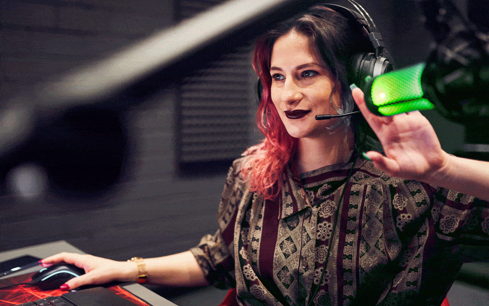
The rebrand is every bit as inspirational as PLAION itself. A design that lends the brand a whole new spirit and is filled with life at every turn: agile, authentic and powerful. The slogan Filled with life expresses the incredible creativity that lies at the heart of the entire corporate group.
How a new name becomes an identity
The new design for PLAION highlights the connection between entertainment and gaming, bridging the gap between these two business fields. The new name PLAION underscores the mission to deliver first-class entertainment: press ‘Play’, dive into the world of PLAION and experience the joy of turning shared ideas into reality. This is also expressed through the letters ‘IO’, which allude to both binary code (‘1/0’) and the ‘On’/‘Off’ play button. The pronunciation alone – ‘play on’ – creates a direct connection to the international entertainment industry and so shows exactly the direction in which the group plans to head.
‘Never touch the logo!’ is outdated
PLAION’s brand image represents a ‘Play’ button that changes constantly in response to interactive input. And if you look really closely, you’ll notice the first letter ‘P’ in the PLAION pictogram. This is a striking element of the design because the – now rather outdated – doctrine ‘never touch the logo’ followed by so many graphic designers has been courageously thrown overboard. The icon can be used as a screen, turned into a 3D object and can also be trimmed. The entire branding concept was designed to be modular. The balancing act between expressing the entertaining and inspiring world of gaming and cultivating a professional and authentic B2B brand is reflected above all in the visual style and colour scheme. The brand’s colour scheme extends from a dark surrounding, featuring vibrant colours bursting with energy, through to a more restrained, calm appearance. The scheme can be cleverly adapted for communication with different target groups, but with the design staying on brand at all times.